Oct 2022 update: A newer, much larger and likely less biased meta analysis of 1,001 tests is now available!
What can you learn from 115 publicly available A/B tests? Usually, not much, since in most cases you would be looking at case studies with very basic data about what was tested and the outcome of the A/B test. Confidence intervals, p-values and other measurements of uncertainty will often be missing, and when present they are often poorly calculated and the statistical procedures are not shared and thus are hardly of any use. One source – GoodUI.org has a slightly better approach in that for each of the tests* published on their website there is basic statistical information: the number of users and conversions exposed to each test variant, as well as what was tested (example).
I set out to gather this data and I preformed a statistical meta-analysis of the outcomes of all 115 tests which is presented below in great detail. It is intended as an overview of average outcomes from a sample of A/B testing / conversion rate optimization activities, but more so as a guide to better statistical practices when designing and analyzing A/B tests.
One of the major findings is that about 70% have low statistical power relative to expected treatment effects and economic logic, which hints at optional stopping issues. After pruning and statistical adjustments, the remaining 85 tests showed a mean and median lift of just under 4% relative change while the statistically significant ones had an average of 6.78% and median of 5.96%. The GoodUI sample is likely not representative of all A/B tests done so any generalizations to the whole of A/B testing practice should be made with great caution.
I will first discuss issues and necessary pruning done to the initial data set then share the detailed results of the resulting meta-analysis, followed by a brief discussion at the end. Clicking on each graph will open it zoomed to 100%, removing any blurring due to browser resizing.
Statistical Recalculations & Pruning
Data on the GoodUI site comes with statistical significance calculations and confidence intervals, as well as their own assessment of how strong the result is, with possible values of “Insignificant”, “Possible”, “Significant” and “Strong”, going in both directions. It also contains the observed percentage change. Power calculations are possible due to reported sample sizes.
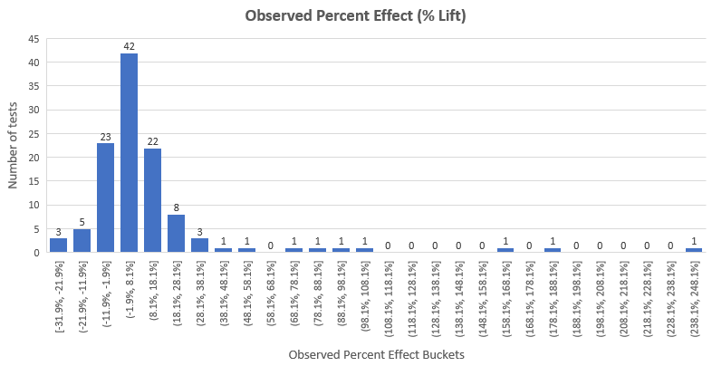
The distribution of the observed effect sizes of the whole dataset in terms of percentage change looks like so:
We can see that the results almost follow a normal distribution with mean lift 12.33% with the exception of a heavy right tail. We will get back to that in a few paragraphs. The median lift is 4.89%, meaning that 50% of the tests had an observed lift of less than 4.89%, the true lift could be even lower. Note that this also contains the observed lift of tests that would not pass a 95% significance threshold.
Statistical significance and confidence interval recalculations
Unfortunately, one of the first things I had to do once I’ve manually extracted the number of users and conversions for each test was to recalculate the statistical significance (p-values) and confidence interval bounds. This is due to two issues with the statistics as presented on the site:
1. Both significance and CIs are calculated with a two-sided instead of one-sided alternative hypothesis. One-sided calculations are obviously called for when making directional inferences.
2. P-values (statistical significance) and confidence intervals were calculated for absolute difference, while inferences were made for percentage change (% lift). I used proper p-values and confidence intervals for % lift instead.
The first recalculation results in less perceived uncertainty, while the seconds results in higher perceived uncertainty. The overall change was such that all significance levels and confidence interval bounds reflect less uncertainty than the original ones, since the one-sided correction swamps the percentage lift correction.
These changes resulted in the reclassification of the outcomes of about 18 of the 115 tests, according to the GoodUI definitions*:
| Classification | # of Tests | % of Tests | # of Tests (Recalc.) | % of Tests (Recalc.) |
|---|---|---|---|---|
| Strong positive | 28 | 24.34% | 32 | 27.83% |
| Possible positive | 39 | 33.91% | 39 | 33.91% |
| Insignificant positive | 14 | 12.17% | 10 | 8.70% |
| Insignificant negative | 15 | 13.04% | 5 | 4.35% |
| Possible negative | 15 | 13.04% | 21 | 18.26% |
| Strong negative | 4 | 3.48% | 8 | 6.96% |
* A strong result has a p‑value of 0.03 or smaller, a possible result has a p‑value of 0.25 or smaller, insignificant results have a p-value higher than 0.25. Each subsequent classification is applied consecutively (a test is not both Strong and Possible if it has a p-value of 0.01). The GoodUI specifications also contain a sample size requirement for each class, but it doesn’t make sense since the p-value calculation includes a smarter sample-size adjustment than their rough approach.
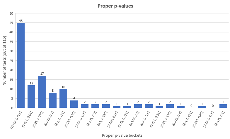
According to a more standard p-value threshold of 0.05 (95% confidence) we have 45 statistically significant winners and 12 statistically significant losers (39.13% and 10.43% of all tests), leaving 58 tests (50.44%) with non-significant results. The distribution looks like so for the proper p-values:
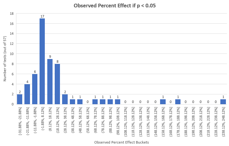
Here are the effect sizes of tests that meet the 0.05 p-value cut-off with properly calculated one-tailed p-values for percent effect:
Naturally, these have a higher mean and median: 22.94% and 7.91% than all tests, but are, again, only 57 of the 115 tests.
Removing Imbalanced Tests
In 3 of the 115 tests (#55, #72, #90) there were significant imbalances between the number of users in the control and the treatment group. In the first case the variation was shown to 16% more users than the control (sample size of 200,000+ each), while in the last two cases the variation was experienced by 9% and 13% less users compared to the control (sample sizes of 20,000+ and 10,000+). We can speculate about the reasons: improper randomization procedure, technical issues leading to some users not experiencing one or the other, solution using multi-armed bandit or similar approach of rebalancing the arms during the test, etc.
The only legitimate case would be if the randomizer was set to unequally distribute the traffic between variant and control, but the numbers are such that I doubt that is what happened.
If it was any of the illegitimate cases it is apparent that any statistical analysis on such data would be biased due to the compromised randomization and having high suspicion of the presence of intended unequal allocation I decided to just remove these 3 tests altogether for the final analysis.
Removing obviously compromised tests
A common issue in conducting statistical design and analysis of A/B tests is performing multiple looks at the data with intent to stop (peeking), without making any statistical adjustments for that behavior. This is the so-called “waiting for significance” approach.
Just a few looks can highly inflate the likelihood of seeing a nominally significant result multiple times when in fact the true probability of observing it is much lower. For example, a test with a nominal p-value of 0.025 which was arrived at after just 5 peeks has an actual p-value of ~0.08, well outside the 0.05 threshold and 3.2 times higher than the nominal. There are ways to peek at the data as it gathers and one of which is the AGILE A/B testing method.
One way to spot compromised tests is to look for tests with unrealistically low statistical power. That happens by asking the question: if I were designing the test, what power level would I have been satisfied with, given the magnitude of the intervention, the expected benefits of X% true lift, the fixed costs, the variable costs, etc. (choosing a proper sample size, statistical power and significance level is discussed in detail in Risk vs. Reward in A/B Tests: A/B testing as Risk Management).
For example, no one would reasonably design a test to have 90% power to detect 20% relative change if the only difference in the variant is the text of a button or a similar such small change. It is simply unrealistic that the result of the intervention will be so huge and thus the testing resources will simply be wasted with such an underpowered test. The question one should ask themselves when determining the proper sample size and thus minimum detectable effect is: what kind of result will be exciting for us? Is it 1%? 2%? 5%? 20%? The answer varies from test to test, but in A/B testing it is rarely above 10%.
Due to this, no reasonable person designs A/B tests with 90% power at a minimum detectable effect (MDE) larger than 40%, simply because this would mean a very low chance of detecting any true effect lower than that. This is due to the familiar curve of the power function as product of effect size: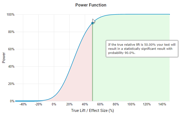
The screen is from our statistical calculators for A/B testing and on it you can easily see that if you have 90% power to detect a true lift of 50% then you only have 45.7% probability to detect a true lift of 25%, and even less for smaller true effects. I’m not aware of A/B tests that make economic sense at such levels. Add to that the fact that most tests, even before pruning, end up with a median effect size of 4-5% and it becomes even more evident that designing tests with minimum detectable effects at levels significantly higher than those is not reasonable.
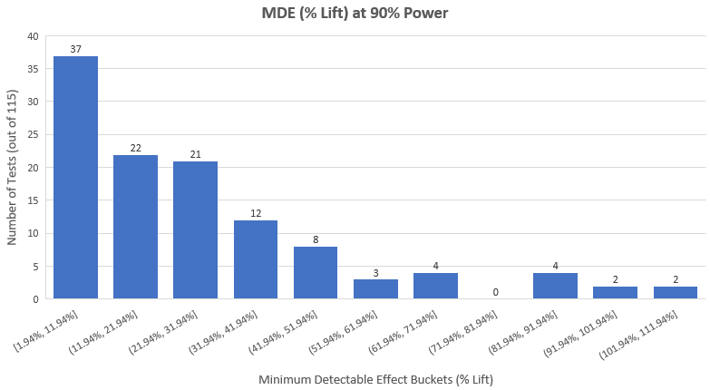
Therefore, it is worth looking at the distribution of effect sizes at 90% power of the 115 tests we have at hand if we want to detect compromised tests. Here is how it looks (average minimum detectable lift is 27.8%, median: 20.84%):
It quickly becomes obvious that either:
A: We have a bunch of tests in which the planners were very sure that the improvement will be astronomically high
B: A bunch of tests only make economic sense to be run if they achieve astronomically high results
or
C: We have a lot of people running tests without fixing their sample size in advance, peeking all the time, and finally analyzing them as if they did not peek at all.
I think C is the most likely answer for a lot of the tests. Even if they did not do that and used some kind of proper sequential analysis, this is how the tests are presented: the p-value calculations match those for fixed-sample size tests and this only makes sense if they were designed as fixed sample size tests.
By manual inspection of each test intervention and applying my knowledge of reasonable effect sizes from those interventions, as well as the economics of A/B testing, I’ve arrived at my (somewhat subjective) assessment that 80 of the 115 tests (69.57%) were underpowered and therefore suspect for optional stopping to a different extent. I have to add that I was generous in my assumptions.
Still, I didn’t want to analyze just 30 tests or so and also understand the suspicions one might have about the subjective part of my judgement, so I decided to remove only the most obvious offenders: tests with minimum detectable lift of 40% or higher, at 90% power and with a significance level of 0.05 (95% confidence). Note that I was generous in the power calculation, too, since the GoodUI classification uses a p-value cut-off of 0.03, not 0.05.
The result of the above pruning is that 25 tests were removed for being obviously compromised through unaccounted for optional stopping (peeking). Since there was no information about how many peeks there were and what times they were made at, there is no way to adjust the p-values and confidence intervals to compensate for it. The total number of removed tests becomes 28 (3 for imbalanced sample sizes), leaving 87 tests to analyze.
Multivariate tests analyzed as A/B tests
Another issue I encountered was the presentation of a multivariate test (MVT, one control vs. several variants) as two separate A/B tests. I was able to tell that this is happening since the control looked exactly the same and had the exact same sample size and conversion rate in two consecutive tests. There was also one test in which the full experiment was described in a blog post, and it turned out that not only was this a multivariate test, but it had another variant which was not reported at all. This is an issue since in a multivariate test one needs to adjust his p-values and confidence intervals to reflect the fact that more than one variant is tested against a single control. One can’t simply do a series of pairwise t or z tests, or do p-value calculations only for one of the variants against the control, which is what is done in the GoodUI case.
The consequences for the validity of p-values and confidence intervals is similar to that of unaccounted peeking: higher actual probability of observing the results, compared to the nominal probability reported. Since I do not know how many variants were present in each A/B test, I was not able to apply the Dunnett’s correction to the results and to minimum detectable effect calculations. Thus, I ended up removing just two tests (#16 & #17) since I know the number of variants and the effect size was larger than 40%, so essentially the reason for the removal is that it is likely a case of unaccounted for optional stopping.
The rest I decided to keep since many of them were properly powered even after assuming 1-2 more variants than what was presented.
Results from the A/B Tests Meta-Analysis
The meta-analysis of the total 115 test revealed that a significant number of them (80 = 69.57%) suffer from lack of statistical power, suggesting more or less severe methodological issues. For 27 of them the issue was beyond doubt, so they were pruned from the data set. 3 of the tests suffered from significant imbalance in the allocation of traffic to the control and treatment groups so they were removed to avoid using results biased by possible technical issues. 16 of the tests were the results of 8 multivariate tests presented as separate tests, which compromises our ability to properly assess their error control. Of them only 2 were removed, the rest were left in the pool of tests for final analysis (a disputable decision).
So, after removing 3 tests for imbalanced randomization and 27 tests for being obviously statistically compromised due to lack of fixed sample size and unaccounted peeking, we are left with 85 tests to perform a meta-analysis on (out of the initial 115).
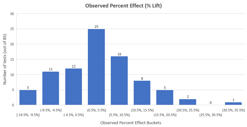
The mean % lift achieved by all 85 tests is 3.77% while the median lift is 3.92%. The distribution looks like so:
It is close to a normal distribution around the mean of 3.77%, with the majority of effects (58%) being between -3% and +10%. As you can see, most of the extremely high results are gone after the pruning – there were 8 effects larger than 35% in the initial data set (first graph of this post). That happens because extreme early results combined with peeking often ends up with tests being stopped early with extremely large lifts – naturally, these results also have extreme uncertainty attached to them.
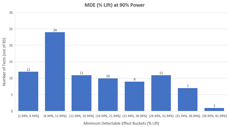
The fact that most effects fall below 10% lift further supports the point about most test being underpowered since only 24 out of the 115 tests had a minimum detectable effect of less than 10% with 90% power and 95% significance.
The observed effect sizes of the tests that were statistically significant (p < 0.05) is: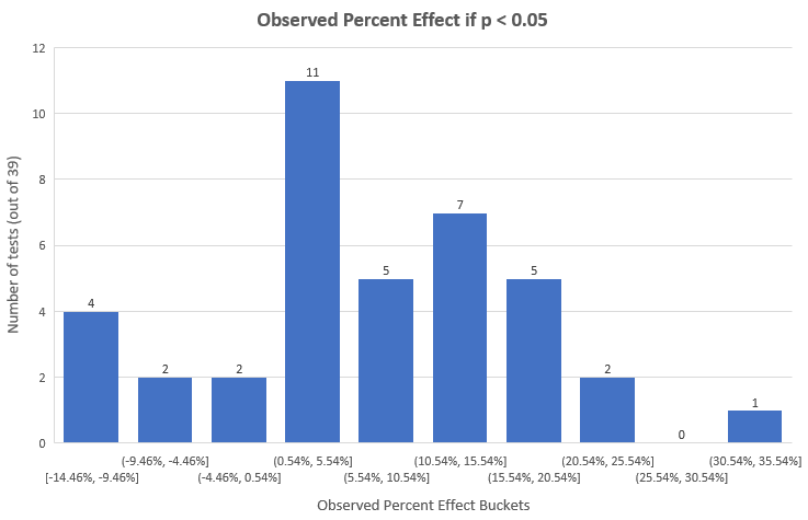
Most tests end up in the 0.54% – 5.54% bucket, while the majority is between 0.54% and 20.54%. The arithmetic mean of the observed effect size of statistically significant tests is 6.78% lift while 50% of tests reported results less than 5.96%. These sizes are naturally larger than the overall since these are just the statistically significant results.
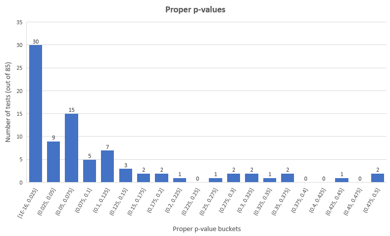
The p-value distribution of the 85 tests looks like so:
As you can see only in 39 out of 85 tests (45.88%) a statistically significant result was observed, with 8 of them being negative results. A lot of tests (20) had results in the 0.05 – 0.1 p-value range.
With so many tests not reaching a commonly used significance threshold, one has to wonder what is to be done with them? Obviously, discarding them as worthless is a bad idea. The usual way such tests are analyzed is to look at their power and MDE to determine what effects were ruled out. Here is what the MDE distribution looks like for the 85 tests:
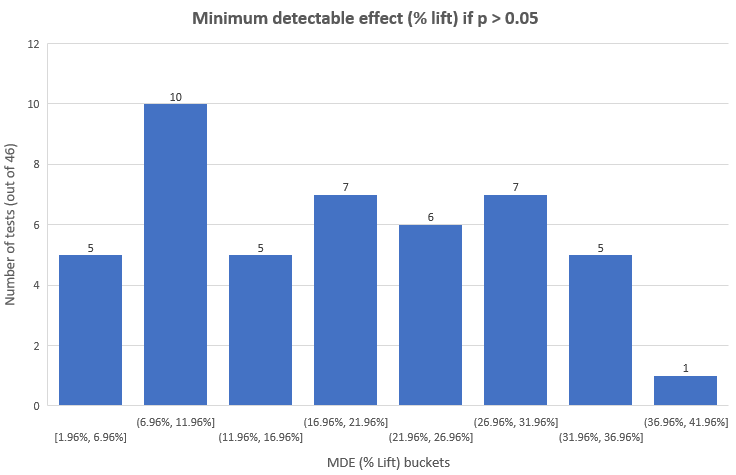
And here is the distribution for tests that are not significant using the 0.05 threshold:
As you can see, we have only 15 out of the 46 (32.6%) non-significant tests for which the MDE is below 12%. For them we can rule out effect sizes of 12% or larger with probability 90%. For the remaining 25 tests, however, the minimum detectable effect is so high that ruling it out is hardly informative: such large effects are near impossible given the magnitude of the interventions in most of them.
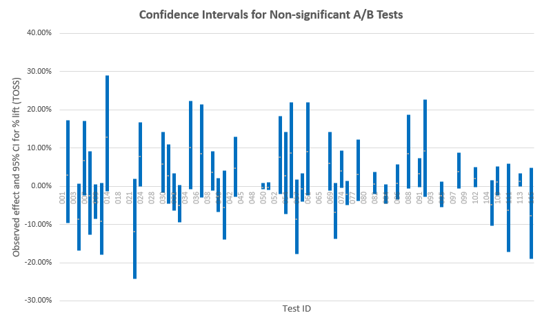
Looking at confidence intervals is another, usually more intuitive way to assess which effect sizes have not been ruled out (the ones covered by the interval):
There are some tests with narrow intervals around the null – these are the well-powered tests. A few of them can actually be called positive equivalence tests, that is, it can be inferred with high probability that there is no difference between the variant and the control. GoodUI does not make good use of this knowledge as these test are classified simply as “Insignificant”, as if nothing can be gained from this data so that is a missed opportunity.
Note how many tests with observed results in the negative actually cover large positive effects, and vice versa – these are the poorly powered tests. The wider the interval, the less powerful the test was, in general.
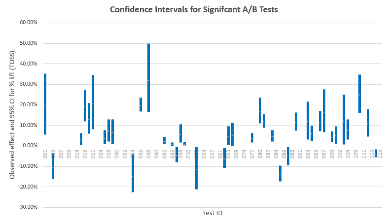
While we are at it, let us examine the confidence intervals for the statistically significant tests – this will give us an idea of how close the observed effect sizes are likely to be to the true effect sizes:
We see that a lot of tests barely exclude the no difference zone, with many interval bounds laying within a couple of percentage points around 0%. These are tests that would be suspects and whose results will come into question if my suspicions about peeking are correct. There are some intervals which are quite far away from 0%, which speaks greatly about the likelihood of this data being an expression of a true large difference.
Here as well the narrower intervals are from powerful tests while the wide ones are from underpowered tests. For example, tests #36 and #38 both have a lower bound above 16% lift, however the #38 CI is much wider – it was underpowered and the reason why the lower bound is so far away from 0% is that the observed effect size (and likely the true effect size) is quite large. That is, of course, assuming that there was no peeking and other statistical abuses.
Discussion & Takeaways
Only 31 of the 115 tests (27%) were statistically significant positive ones (after pruning), which is higher than other industry reports where numbers as low as 10% or even 5% are cited. Not having more significant results is certainly partly due to the lack of statistical power in roughly 70% of the tests analyzed and partly due to the interventions not being effective or having a pronounced negative effect. Reporting/publication bias should be taken into account before considering these numbers to be representative of the wider industry.
The average percentage change from statistically significant positive tests is 10.73% (median 7.91%) and that it is partly dampened by statistically significant negative tests for the duration of the tests since the mean for all significant tests is 6.78% (median 5.96%) and for all tests it is under 4% (mean 3.77%, median 3.92%). I believe that despite its lack of representativeness this data can be helpful in informing decision-makers about the possible results of conversion rate optimization programs. I think this should also help practitioners when deciding on the minimum detectable effect as a part of power and sample size calculations. I’m all for making these decisions on the level of each individual A/B test while taking into account all costs and benefits, but having some external benchmarks certainly helps in assessing risk and rewards associated with tests.
There is a missed opportunity in learning from tests that actually provide strong data for lack of effect of any significant size: these are just classified as “Insignificant”.
The outcomes of this meta-analysis can be limited in usefulness due to the non-representative sample. Other things to consider is that the tests included had different primary outcomes: some aimed to alter mere click behavior, others aimed to improve trial registrations, purchase rates, etc. None of the tests reported or had revenue as a primary KPI and at least one test (#24) has a primary outcome that can possibly be directly at odds with revenue-based KPIs (success in the test might hurt mid and long-term revenue). Another issue is the lack of information about the stopping rules used: if the suspicions laid out above are correct and 70% or more of the tests were not executed correctly the results from a big portion of the data set might be biased towards statistically significant findings in either direction.
In terms of collecting and reporting A/B test data I believe the takeaways are obvious: make sure to calculate statistics properly, for which you need to know how the test was designed, statistically. You need to know if it was a fixed-sample or sequential monitoring design, number and timing of analyses if sequential, how many variants were in the test, whether there were any peculiarities in traffic allocation, etc. These are all things discussed previously on this blog, and elsewhere.
What do you think of the data presented? What are your takeaways and conclusions?
Notes
* The 115 tests are a part of the GoodUI free evidence database available on the website and are mostly older tests, compared to the most-recent ones available as part of their “fastforward” paid service here.
GoodUI was presented with a 99% complete draft of this article for review and their (minimal) input is reflected in it.


Georgi, thanks a million for sweating over these tests! 🙂 Much appreciated. I love your analysis. Here are some of my thoughts:
1) Yes, many of those tests have low statistical power. They were run by a range of businesses with different amounts of traffic. Hypothetically, imagine that a business ran a test for 4-6 weeks and only accumulated 500 conversions with lower effect and a suggestive result. Now imagine that the business had other ideas waiting to be tried, and under this pressure a test is stopped. That’s the reality in practice.
2) The other reality is that yes, often tests are peeked or checked regularly – no one wants to commit to running an solid negative experiment to the full duration, if the begins to show weakness (I believe you are a supporter of this with your agile approach to testing.
3) I also find it interesting that most the experiments that you analyzed (on GoodUI Evidence) are ones which we consider as isolated or smaller tests (more or less with a single hypothesis / small change). In comparison, we also sometimes take on a completely different strategy of testing a “larger impact” variation with multiple high confidence changes. In contrast, my overall feeling is that such tests have a larger median effect. Ex when we looked at 26 such experiments (from https://goodui.org/datastories) the median impact was 22%. Unfortunately, Datastories might have been even more influenced with publication bias, as it was a monthly editorial of experiments (I’m sure we had more negative experiments from larger tests as well). Would be great to compare big and small tests together. 🙂
Any other thoughts?
Best,
Jakub
1) I know the realities in practice, but the thing is that no one should do tests expecting 40%+ effects from minor changes. If you are so certain the effect will be so huge and don’t have the time to test it properly – just implement the thing… Thus I remain convinced that we are surely talking about unaccounted peeking in those cases.
2) Yes, I fully understand and it makes all the sense in the world, when done properly. When not – it leads to bias in the results that cannot be corrected post factum.
3) I can’t comment since I don’t have access to those. Publication bias is hard to account for, but a test in which the variation has major changes informed by prior tests and proven best practices is sure to lead to significant lifts. We ourselves have single change tests that resulted in high double-digit or even triple-digit lifts, confirmed afterwards by the change in conversion rate level over long periods of time (so not a fluke and not an overestimation). This mainly speaks about how badly needed some changes were :-))) I think there is value in both single change tests and multiple changes tests – they inform us of different things and are appropriate in different situations. For example, 3 changes tested separately might not bring any visible result, while the 3 changes together might have a significant impact due to interaction effects. Or vice versa…