As any UX & CRO expert should now, the way we present information matters a lot both in terms of how well it is understood and in terms of the probability that it will lead to the desired action. A/B testing calculators and other tools of the trade are no exception and here I will examine a widespread issue with how such calculators present information to their end users.
In particular, I will focus on the commonly used visualization of confidence intervals and by extension – expected distributions (?), and posterior distributions. In the interest of keeping the article short I will intentionally disregard any of the other issues that may also be brought up.
In writing this article I’ve conducted an unstructured survey in the form of a single question in which participants were asked to interpret a particular set of confidence intervals. The findings from it were quite intriguing and presented further below.
The article is structured as follows
- The issue of presenting inappropriate statistical estimates
- How widespread is poor data visualization?
- What are the perils of poor visualization of statistics?
- Data viz survey results & discussion
- The responsibility of A/B testing tool vendors
The issue of presenting inappropriate statistical estimates
To briefly introduce the topic, let’s look at this presentation of the results of a mock A/B test. It is a slightly doctored* screenshot from a free online A/B testing calculator:
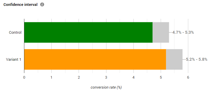
The questions one has to ask when faced with such a presentation of the outcomes (colored portion of each bar) and their uncertainty as estimated through confidence intervals (grey portion of each bar) include:
- Are the visual and numbers presented enough to make a conclusion with regard to the outcome of the A/B test?
- If so, is this the easiest and most unambiguous way to present the information?
- If the answers to neither #1 nor #2 are positive, does the graph at least add information which might be helpful in interpreting the outcome?
Obviously, all of the above presupposes that one has chosen to use confidence intervals to guide their decision, that a confidence threshold was chosen in an informed manner, and that all other prerequisites for valid inference are upheld in the design and execution of the A/B test.
The first and second question are the most crucial. To answer them, we need to know what the goal of the test is. Most A/B tests, regardless of the chosen metric, have as a primary measurement the difference between a characteristic of a treatment group and the control group. It could be a difference in means (such as with ARPU, AOV, etc.) or difference in rates (percentages, such as with conversion rates, transaction rates, bounce rates, open rates).
The intervals above represent the uncertainty estimated for the metric of interest in each individual test group. However, what we are interested in is a single confidence interval for the difference between the test groups which is produced using a different statistical model. Such an interval is not shown hence we can’t directly inform our decision about this A/B test.
Therefore, the answer to question #1 is that these intervals do not reflect the confidence limits we need to interpret the outcome of the A/B test with regard to its primary goal. Even in the most favorable of situations when the intervals overlap to a great extent or are separated to a great extent we can only reach a rough estimate for the uncertainty. This is far from the exact estimate which is required and easily available if we had simply constructed the interval for the difference in the metric of interest.
If you still have doubts about the need for constructing an interval for the actual metric of interest instead of component parts, consider this. If the required confidence level is 95% and the above are 95% intervals (they are), on accepting the use of these intervals one should fail to reject the null hypothesis of no difference since the intervals overlap. However, when constructing the proper interval – for the difference in proportions, it becomes clear that it excludes zero so the null can be rejected at the 95% level.
With the same data** which produced the above intervals the two-sided 95% interval for absolute difference in proportions is [0.0004 , 0.0091], while the one-sided*** one is [0.0011 , +∞]. If lift / relative percentages are of interest, then the correct 95% intervals are [0.683% , 18.773%] and [2.105% , +∞], again excluding zero. This means the above visual presentation can easily lead us to incorrect interpretation of the data with regard to the goal of the A/B test. This point is painfully illustrated in the survey results below.
While a trained statistician might be able to extract the correct interval under particular circumstances and thus the answer to the first question is NO with an asterisk, the answer to the second question is a resounding NO as in ‘No, this is far from the easiest and most unambiguous way to present the data’. Even when possible, additional computations are needed to produce the appropriate interval from the data contained in these two intervals so it is much easier and less ambiguous to simply present the appropriate estimate – an interval for the difference between the two test groups.
Does the graph add useful information is the third question we asked. I don’t believe it does, assuming the stated goal of most A/B tests. The information presented in the above graph is already contained in a proper confidence interval for the difference in conversion rates so it adds nothing to the picture. Perhaps if there were secondary goals which required uncertainty estimates for each individual test group…
In summary, such a presentation fails to provide the necessary information to make a decision about a typical A/B test, it is not the most straightforward and useful way to present the outcomes from the test, and it is highly questionable if there are situations where the information it does give is of any actual use. It can also lead to incorrect interpretation of the data.
* the x-axis was relabeled to correctly reflect what is presented, and the green and orange colors were swapped in place of the original ones
** 20,000 users in the control group with 1,000 conversions (rate 0.05); 21,000 users in the test group with 1,150 conversions (rate 0.05476). Before you ask – yes, I know there is a severe sample ratio mismatch issue with such a test.
*** strictly speaking, the entire scenario is for a one-sided hypothesis, as usual, but I don’t want to get into the one-sided vs. two-sided debate here.
What are the perils of poor visualization of statistics?
Efficiency is the name of the game in business and so A/B tests, if informed by a proper risk-reward analysis, should have a confidence threshold which is informed by the business question at hand. One would like to gather enough data to satisfy the threshold while balancing the type II error, but no more.
If one is mislead by a visual presentation such as the one presented above, they would require a significantly higher evidential threshold than necessary. In the above example the p-value is 0.0153 (0.0173 for % lift) which corresponds to a confidence level of 98.47% (98.26% for % lift), yet by way of visual inspection of the overlap of the two intervals one would fail to accept this uncertainty as satisfying a threshold of 0.05 (95% confidence level).
This is already equivalent to requiring more than 3 times less uncertainty than planned! And this is just with the numbers we use as an example.
What’s worse, if the intervals were to not overlap at all before we declare Variant 1 a ‘winner’, we’d be imposing an actual confidence threshold of about 99.9% instead of the target 95%! This is equivalent to achieving 50-times less uncertainty than the target level and is definitely no joke. If enforced at the design stage, it would require more than doubling the sample size to maintain statistical power.
The above scenarios contradict every experimenter’s desire for speed, minimization of resources, maximization of opportunities, minimizing unnecessary missed opportunities, and so on.
If you’re tempted to argue against any given confidence level, please note that the general premise holds even if we replace the target with 80%, 99%, or 99.99% or any other number you find more appropriate.
How widespread is poor data visualization?
It is interesting to take a look at how widespread poor visualizations are among A/B testing tools, from simple calculators to statistical engines embedded in major A/B testing platforms.
As I don’t want this to turn into a finger pointing exercise I will not name any of the tools I use visuals from. What I will say is that I’ve surveyed the most popular tools by way of a simple internet search. All of them are free and include the market leader with up to 40% market share among testing platforms according to some estimates. This doesn’t mean paid tools don’t make the same mistakes in one form or another, but due to financial and time constraints I do not feature examples from them.
Given how easy it was to come up with these examples (just a few minutes of searching and browsing), and that among them is a tool used on more 40% of all websites which use one of many 3-rd party testing platforms, it is safe to assume that this issue is quite widespread.
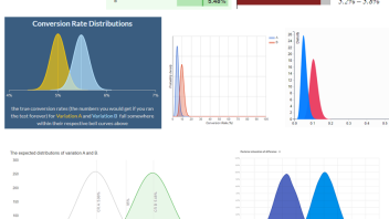
Here is a curated set of poor visualizations from 6 different tools, to the exclusion of the tool used in the main example of this article (click for full size).
The same data was used as input in all but two of the tools in which using it resulted in unreadable graphs and in one which doesn’t allow direct entry of data. In those two the input was scaled so it resulted in roughly the same statistical estimate.
Note that these aren’t just frequentist tools presenting confidence intervals. In fact more than half of them are Bayesian tools which commit the same mistake but instead of confidence intervals they plot posterior distributions. In fact, most free frequentist tools I went through weren’t keen on displaying any intervals and mostly confined themselves to showing a p-value, a confidence threshold equivalent, or just verbal output.
The above are just a subset of the possible poor visualizations when it comes to confidence intervals and related concepts from other schools of thought. Very often the same mistake is made where intervals are plotted alongside a mean on a timeline graph or are listed in a table of values. Here is one example that most of you have seen:
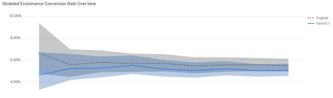
Instead of these two intervals which can easily lead one astray, it would have been much better if there was a single metric – the difference between the variant and the control, and its interval estimate over time. (I know the intervals shown above are pretty much impossible to interpret correctly, but for the sake of argument I assume they are).
To be fair, I need to add that most tools included statistics other than the shown such as a p-value, equivalent confidence threshold, or posterior probability.
However, I maintain that the confusion is still there. Either the two sets of statistics presented seem contradictory, or, as I’ve seen, many users of A/B testing calculators focus on one statistic to the exclusion of all others. Confidence intervals, being more visual, naturally have an advantage in appeal and are thus the chosen favorite (which is one reason I do not display them visually in any of my tools, just as I don’t display visually p-values or severity estimates).
Data viz survey results & discussion
Since I had only anecdotal evidence that such a display of confidence intervals caused major confusion among CRO’s and testers, I figured a way to gather more data is to do a quick survey using my social networks.
It is obviously non-representative and the participants were not chosen at random, but I can tell you that the population the responses were drawn from is that of CRO professionals, statisticians, UX experts, product managers, and online marketers. A quick assessment of the actual respondents shows a heavy bias towards data analysts, experiment leads, conversion optimization professionals, mostly higher-ups (heads of departments, team leaders, etc.). Additionally, it is perhaps more likely that those who felt certain about their stat skills were more likely to respond than the rest. This should result in bias towards more accurate answers.
The following question:
“If you see the confidence intervals as presented in the screenshot below, what conclusion would you make for the test, assuming you are in your usual A/B testing scenario (usually that means you are interested in detecting a difference between the variant and control with a given limit on the uncertainty, e.g. 5%)? Assume the grey bar sections represent 95% confidence intervals and your target confidence limit is 95% as well. Would you declare Variant 1 a winner or would you say the right action is to stick with the control (test inconclusive)? Or would you infer something else entirely? Please share your answer before looking at what others have said.”
was shared to:
- “CXL – Conversion Optimization, Analytics & Growth” – a public CRO & A/B testing group on Facebook (6 respondents)
- the ‘testing’ channel of the #measure Slack community (4 respondents*)
- my LinkedIn network through a public post on my personal LinkedIN profile (17 respondents)
That’s a total of 27 unique respondents in just 24h and I think this is a great place to say ‘Thank you’ to all of you who participated!
The question was accompanied by the graph from the beginning of the article.
Here are the summary results from all three sources:
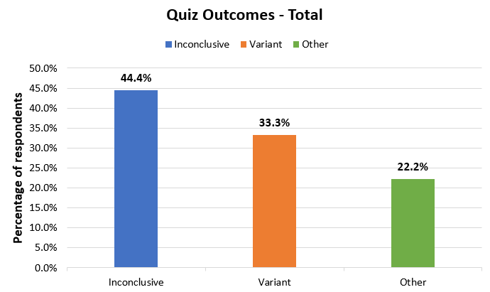
12 respondents (44.4%) said they would not implement the variant and would deem the test inconclusive. 9 respondents said they would implement the variant (33.3%) and 6 responded with an answer which is neither (22.2%).
That means that nearly half of the respondents were mislead by this visual presentation when it was presented to them in isolation. This rate is 85% in the FB group and 75% in the Slack group, and it is lowest in the LinkedIN group at just 24%.
It should be noted though, that many of the 9 who said they would adopt the variant following such a test and given these confidence intervals, actually seemed to have disregarded the instruction to use a 95% confidence threshold in interpreting the data. This is evidenced by statements such as ‘the odds are better’, ‘the variant is performing well’, ‘there is a lot less risk involved with the variant’, and ‘it’s unlikely the variant is worse than the control and might be a lot better’.
While strictly true, these betray that it is possible that they failed to apply the confidence threshold as required by the question and mostly acted on ‘gut feeling’ (that is, experience from running many tests). If we separate these into another category, the results would look like so:
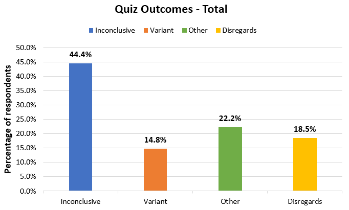
In my mind, nudging someone to disregard the confidence threshold in interpreting the data is akin to making a poor decision, if it ends up being the correct one. It could also be due to the phrasing of the question, so I think separating these makes the most sense.
Of the remaining 3 respondents who chose to implement the variant following the A/B test, only one provided reasoning which doesn’t disregard the confidence threshold – a statistician who computed (with reasonable accuracy) the CI for the difference of proportions based on the information in the screenshot. The other two provided no reason.
What about the ‘Other’ group, though? All of these respondents noted issues with the data visualization, that it doesn’t provide the answer we seek, and some suggested the correct way to resolve the issue. It should be noted that one more respondent questioned the visualization, but still provided ‘inconclusive’ as an answer.
In my opinion these answers and the one answer who chose the variant by accounting for the actual confidence threshold are the only ones who answered the quiz correctly. So that’s a total of 7/27 correct responses or roughly 26%. I think the case against presenting such visualizations is rather clear when just one quarter of a highly qualified crowd are able to assess it correctly (meaning to discard it, with the one exception which required extra labor to produce the correct numbers).
If we are generous and include all the responses who pointed to variant 1, including those who seem to disregard parts of the question, the success rate is barely above 50%, meaning a failure rate close to 50%, which is far outside any reasonable limits, in my opinion.
No matter how you look at it, though, the most numerous group still fails to recognize a winning test by looking at these intervals (44.4%).
On another note, it is interesting how many people raised the question of statistical power without referring to a rejection of the variant and acceptance of the null hypothesis. This confirms the ongoing issues surrounding statistical power, the massive confusion between hypothetical MEI, observed effect size, and true effect size that I’ve seen over all my years in the industry. I’ve discussed these at length in chapter 4 of ‘Statistical Methods in Online A/B Testing‘, but I may be tempted to do a brief installment on the blog in future, given how this issue pops up again and again. I’ve even seen it implemented in A/B testing calculators as well.
P.S. Obviously the survey does not aim to assess the general statistical skills of the respondents and doesn’t do that in any extent. If anything, it shows that even highly knowledgeable and experienced professionals can’t make sense of this presentation of the stats without the need for additional info. The argument is that it would not have happened with the proper CI presented in isolation.
* One person’s answer was present both there and on LinkedIN so it had to be deduplicated
The responsibility of A/B testing tool vendors
Having been designing calculators for many years now, both basic and advanced statistical calculators at Analytics-Toolkit.com, and more recently at GIGAcalculator.com which also includes various statistical calculators, I can understand the immense task facing anyone serious about making good statistical software. There are so many established conventions which make little sense or are in fact counter-productive. Yet, if you don’t include certain features or if you don’t use the naming and design which is common in the industry your tools face adoption issues and user resentment.
I can understand how sometimes we are more or less forced to adopt certain things in our tools to the market. Making tools as frictionless as possible and as accessible as possible is everyone’s goal, and this is part of that. We’ve done small compromises in the past and a few still linger around as we await for the A/B testing industry to catch up a bit.
However, I don’t think these compromises should ever come at the cost of possible confusion of the type demonstrated here.
I also understand the importance of visual appeal, but it can’t ever trump function and visuals should never be added without necessity and solid justification.
In the end, I have to note that this particular issue is not new and was brought up by me on multiple occasions, most recently on TowardsDataScience (second mistake with confidence intervals) and on the CXL blog here (interpretation). The proportion of correct responses in my small survey also suggest that a number of people in the industry already know better. I’d say it is time to more actively take responsibility by designing tools which minimize the probability of misinterpretations and confusion.
About the author

Managing owner of Web Focus and creator of Analytics-toolkit.com, Georgi has over twenty years of experience in online marketing, web analytics, statistics, and design of business experiments for hundreds of websites.
He is the author of the book "Statistical Methods in Online A/B Testing", of white papers on statistical analysis of A/B tests, and has been a speaker at conferences, seminars, and courses. Georgi has been distinguished as a winner in the Data & Analytics category of the 2024 Experimentation Thought Leadership Awards.

